For a very long time, I had thought of getting a logo done. I put that off as many other priorities took precedence.
Recently, I started working with a developer to move my blog from WordPress.com to a self-hosted WordPress.org. The design will be based on a “WordPress theme” but to personalize it, I needed a “motif” and design directions. I decided that doing the logo would probably help with that as well.
So finally, several weeks ago, I put some design thoughts together for the logo and posted the job on fiverr. What the job posting said, in a nutshell, was that I wanted a logo that symbolized:
- S and Z of Shawn Zahedi
- Music/Art
- Love and Acceptance
- Empowerment/Fearlessness/Strength
- Movement/Flow/Dance/Water
- Global/World/Earth
- Balance/Harmony
- Simple, minimalist (hint, rather than shout)
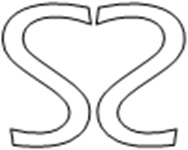
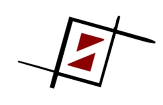
The posting included a few sample images (shapes and designs that I liked) and the two very basic logo designs below –that I had done– as thought starters.
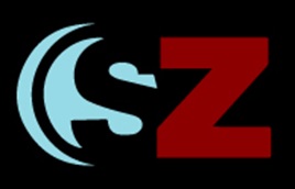
Below are the designs I got back:
As you can see, the designers were very talented. But none of these really spoke to me. So I decided to roll up my sleeves and get a bit creative. I had to go buy a new compass though.
I knew that since I wanted something minimalist and fluid, it had to be based on simple geometric shapes. So with a pencil, ruler and compass, I created these grids:
The minute I did these grid, an idea jumped at me. So on Microsoft Publisher (yes, I’m not using any sophisticated design software) I recreated the grid and that led me to the following sequence of designs:
I kind of liked the design on the lower left of the above image, so I decided to see what it would look like in color. I used the free paint software (GIMP 2) and filled the areas:
The stylized S and Z looked nice but something was missing. I knew I was on the right track and just needed to do some minor tweaks. I decided to take some time off and let the designs seep in.
When I returned, I realized that I had to make the design “hint” rather than “show”. So I made some very minor edits and this is what I arrived at:
To me, the simple lines flow and convey movement. It is balanced and shows harmony. It all fits inside a circle and hints at globe & earth. It reminds me of the G key signature (in music notation). S and Z are visible. It also feels open-ended, not finished, suggesting hope and the future.
So, all in all, I’m pretty happy with it right now. I’m going to let it breathe a bit and come back to it later.
If YOU have any ideas for improving this or like any of the other designs, PLEASE let me know!
P.S. It’s a bit strange and still uncomfortable for me to write about personal things and share them with everyone. But deep down, I do believe that letting the true voice shine through makes for a more authentic (and humble) human being and more genuine connections.
Good night!
Shawn


Leave a Reply